LYSVA (meaning “light water” from a blend of Nordic-sounding roots)
Location: Sweden
Industry: Environmental Technology & Sustainable Forestry
Scope: Brand Identity, Logo Design, Color System, Print Collateral
Overview
Lysva is a newly founded Swedish company focused on sustainable forest management and green technology solutions. As they prepared to go public with their offering, they approached me to create a visual identity that would feel both modern and rooted in Nordic values: clarity, respect for nature, and forward-thinking.
The Process
Discovery Meeting
In our first consultation, the founders emphasized three things:
- Their deep connection to Sweden’s forest landscape
- A desire to appear professional but not corporate
- The importance of sustainability being reflected visually, not just stated
We discussed their mission, competitors, and the emotional tone they wanted customers to feel: grounded, trustworthy, and inspired by nature.
Research & Inspiration
I explored references from traditional Nordic symbols, environmental NGOs, and natural textures found in forests, especially moss, bark, and stone. I also studied green-energy branding to avoid clichés.
Design Direction
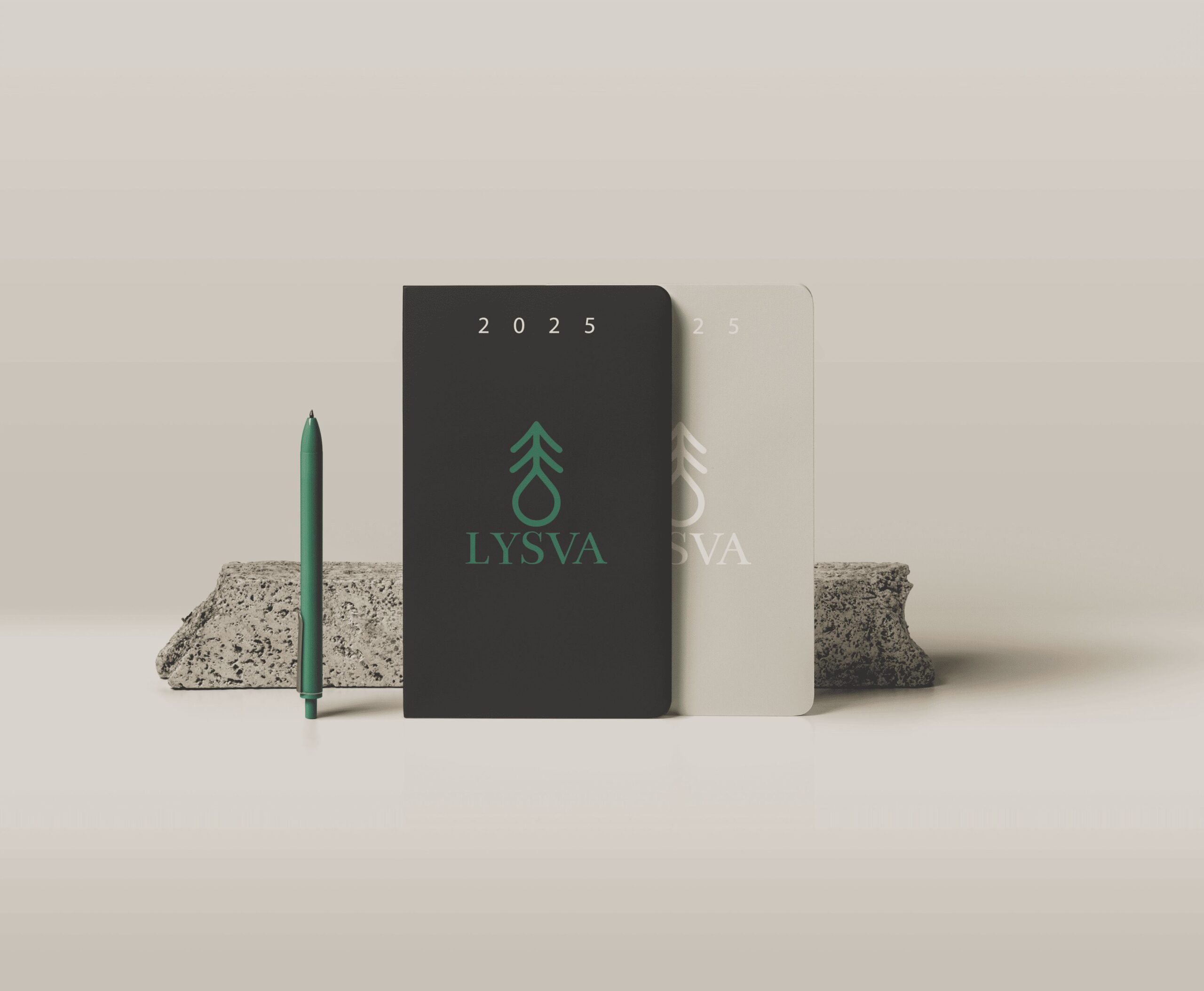
Logo: The final mark combines simplicity and symbolism, evoking both tree rings and a minimal seedling. It’s designed to work at small sizes and on various materials, including recycled stock.
Color Palette: Deep greens, muted yellows, and stone grays were chosen to reflect trust, nature, and longevity.
Typography: A humanist sans-serif typeface was paired with a soft serif to balance structure and personality.
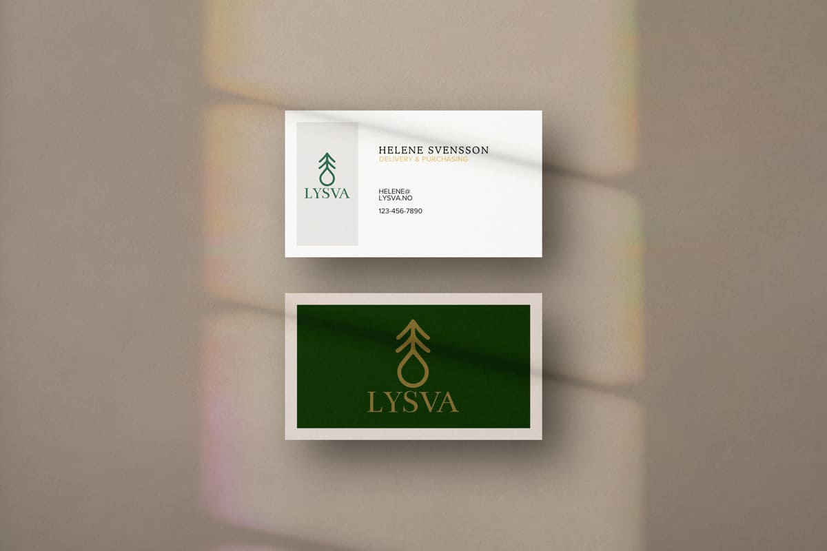
Print: Business cards and stationery were printed on uncoated, sustainable paper.
