Brand Name: VibrantGears
Brand Description:
VibrantGears is a leading sports and outdoor gear brand that specializes in designing and manufacturing high-performance equipment and apparel for adventurers and athletes. With a commitment to quality and innovation, VibrantGears aims to empower individuals to embrace an active lifestyle and unlock their full potential in their chosen outdoor pursuits. The brand’s distinctive lime color reflects its energetic and dynamic approach to providing customers with durable, functional, and stylish products.
Target Audience:
VibrantGears caters to a diverse range of outdoor enthusiasts and athletes who are passionate about adventure, fitness, and exploration. The primary target audience includes:
Brand Values:
Colors: The vibrant lime green gradient used as the primary color in the design system aligns with the brand’s name, VibrantGears, and represents its dedication to energy and excitement. The gradient adds depth and visual interest to the UI elements, evoking a sense of dynamism and enthusiasm. The dark background provides a sleek and sophisticated backdrop, allowing the lime green to pop. The greyscale secondary colors offer a balanced and neutral palette, ensuring that the lime green remains the focal point while providing flexibility for different interface components.

Buttons:
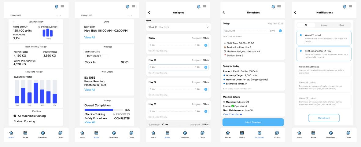
The choice of square buttons with a slightly rounded corner aligns with the brand’s modern and clean design approach. The square shape provides a sense of stability and order, while the rounded corner adds a subtle touch of softness and approachability. This button style strikes a balance between geometric precision and user-friendly aesthetics. It enhances visual consistency throughout the interface and promotes a seamless and intuitive user experience.

Skinny Icons:
The decision to use skinny icons in the design system stems from the brand’s emphasis on sleekness and modernity. Skinny icons have a minimalist and lightweight aesthetic that complements the overall visual style. They provide a clean and unobtrusive visual language, enhancing the usability and clarity of the interface. Skinny icons also allow for efficient use of space, making them versatile and suitable for various UI elements.
UI Card Design
The UI card design with big images, small text, and a prominent green button aims to create visual impact and guide users’ attention effectively. The big images serve as eye-catching visuals that engage users and convey the brand’s adventurous spirit. The small text ensures that it doesn’t overpower the images, providing concise and focused information. The big green button, contrasting against the imagery and typography, serves as a clear and actionable call-to-action, enabling users to interact and take desired actions with ease.

Input fields:
With a gradient stroke on a dark background, they were chosen to align with VibrantGears’ dynamic and modern brand identity. The gradient stroke effect creates a sense of depth and dimension, enhancing the overall aesthetic appeal. The dark background creates a high contrast against the gradient stroke, allowing it to stand out prominently.

Typography (Quicksand + Source Sans Pro):
The choice of Quicksand and Source Sans Pro as the primary typefaces in the design system reflects the brand’s values of dynamism, clarity, and modernity. Quicksand, with its rounded edges and geometric forms, adds a touch of friendliness and approachability to the typography, while Source Sans Pro offers excellent readability and versatility. Together, they create a harmonious balance between the brand’s energetic nature and the need for legibility across different interfaces and screen sizes.