Project Description
A usual task performed on the web is finding information by following links on web pages. In this project, I report the heatmap and gaze paths of users’ eye movements on three different layouts. One layout is the standard list layout. The other two contain categories with different items, while each category is marked with a title. Gaze paths showed that the last two layouts were more likely to attract the users’ attention to products. I also analyzed the area of interest for each layout, counting the number of average seconds the users had spent analyzing each one of the areas. At the end, I am suggesting a set of guidelines for design and other implications for future work.
Secondary Research
Several studies attempt to apprehend the buyers’ behaviour. In this literature it is shown that there are six stages in the process of making a purchase [6]:
- The need for identification is characterized by the fact that the user becomes aware of an unmet need, resulting in the buyer’s being stimulated through products
- Then, the buyers will determine what to buy by evaluating product alternatives based on certain criteria.
- This stage is called merchant brokering and helps users determine from whom to buy. On the web, there are several price comparison websites that can help users decide where to buy their products. Usually, users are looking for qualities such as trust, the relevance of recommended products and ease of navigation
- Stages 4 and 5 make reference to the negotiation of the transaction, purchase and delivery. In order to make the sale, the merchant needs to offer security and assurance.
- The last stage involves receiving the goods, evaluation, customer service and overall satisfaction of the buying experience and decision.
With this in mind, I’ve conducted an eye tracking study to compare different visual design layouts of the users’ search patterns. I have decided to create three types of organized data, each of them having category titles, therefore, in this study, I focus mainly on the interface’s usability aspect and its aim is to study the users’ focus distribution of the layout.
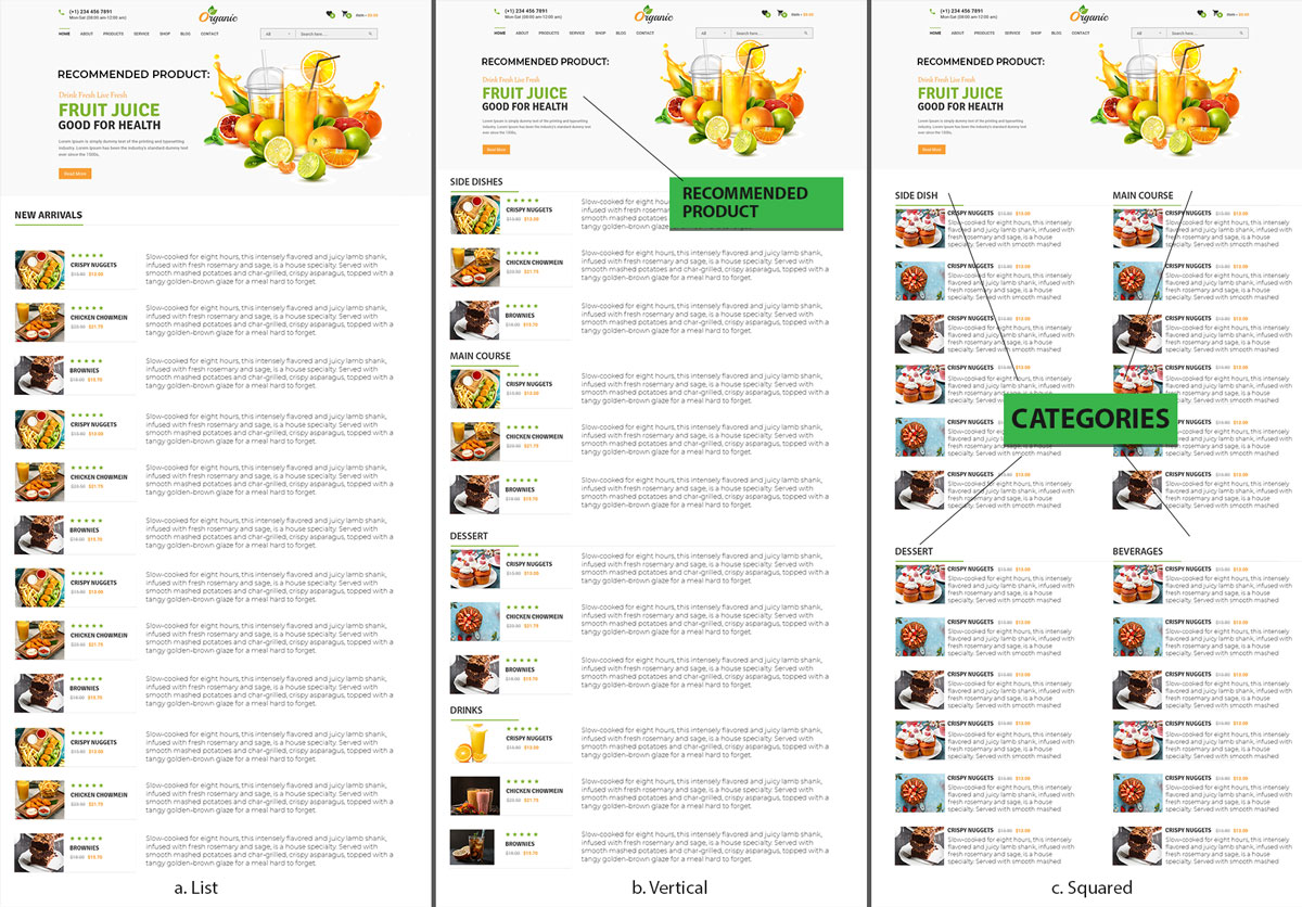
The interface generated is a category of products, each of them having a title, a description and other attributes. Therefore the three main important elements in the layout are 1) the top recommended product, 2) the categories title, and 3) the products shown in each category. After that, each element was arranged differently in each interface. In this experiment, I have created three layouts: the list layout, the vertical layout and the squared layout.
The list layout was designed to be the reference point of the experiment. The recommended product was placed on the top of the page, followed by other similar products from the search result. Each product contains a short description that matches the criteria of the user’s search.
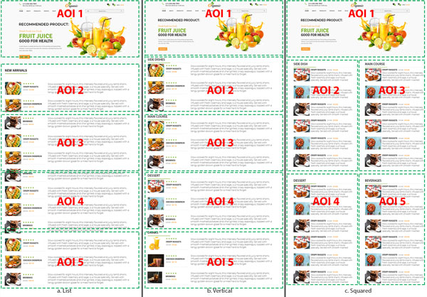
In the vertical layout (see Fig. 1. b. Vertical) the recommended item remains placed at the top of the page. The products are organized into 4 categories. These categories are arranged in vertical order one after another.
In the squared layout, the four main categories are displayed in two categories two at a time, side by side (see Fig. 1. c. Squared). The reason for this was observing whether users will be motivated to notice products from different other categories in this squared layout, therefore conducting a comparison between sections.
Experiment
In this experiment, four participants (two males and one female) were recruited to participate. Their ages ranged from 22 to 31. Three of them were students at the KTH University, while the other was an employee. They were of various nationalities (USA, China, Sweden and Romania). Each subject had to evaluate the types of interfaces to evaluate. Their main task was to find a type of meal that they’ll be interested in buying if the opportunity was given. All the categories were displayed in the interfaces.
An online eye tracker monitor that was used by the phone’s camera or the computer’s webcam was used in the study to trace the users’ eye movements across the layouts. The layout’s resolution is 1200×2500 pixels. Each one of the layouts would stay on the screen for only 40 seconds. The eye tracker works at a distance of 40 – 95 cm.
Results
Heatmap
The heatmap is a powerful way to view the gaze behaviour of an entire group of users. I chose the fixation visualization position as a surface on a specific stimulus. The tracking heatmap collects and views data about the most and the least interesting sections and elements of the experiment. The way it works is that it’s gathering data on how many time times a user looks at particular elements and also on their length fixation, which is then turned into a map in the form of a tracking heatmap. The red and orange colour in the map shows that all the participants stopped their gaze at a specific part of the page.
It can be seen that users looked at more products in the Vertical and Squared layouts. In the Vertical layout, a big “F” pattern can be noticed on the top of the page. Small “F” patterns can also be seen in all the categories.
Concretely, in the Vertical layout, the first three categories were examined more carefully, while the fixation on the last category was relatively overlooked without showing much interest in users. In the Squared layout, each one of the four categories was coloured in green colour, indicating that all four categories were noticed by users. More than that, all the products in each category has been seen by users. In comparison, the List category had only the top part covered in yellow and orange, while the remaining parts had only blue parts indicating less fixation ad less interest. One similar thing that can be observed is that the recommended product on the top of each layout was overlooked by users, all preferring to set their gaze on the categories and their products instead.
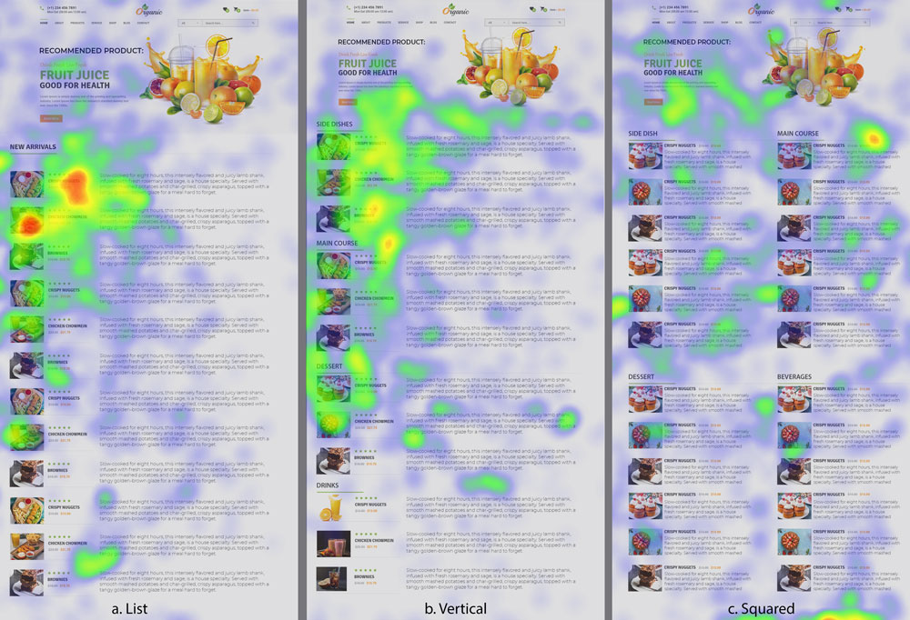
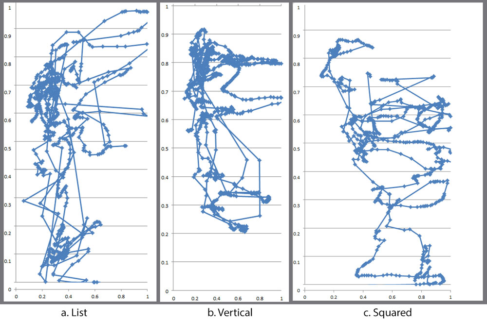
The gaze path shows how the users scan the paths. In this instance, the blue dots illustrate the direction of a fixation.
The List gaze shows that the gaze fixation was first focused on the first products and then the user made a few “Z” style paths from middle to bottom (see fig. a). In the Vertical layout, the longer gaze fixation appeared more on the top two parallel categories, right after the recommended product. Also, the third and fourth categories appear to be less popular (see fig. b). The squared layout exhibits similar behaviour (see fig. c), although it appears that there are more come and go and left to right scan paths between products.
Areas of Interest (AOI)
In the Vertical Layout and the Square layout, each category represents an AOI. Therefore, the List layout was also divided into five AOIs: the top of the page recommended products, the title and the first two products, the 3rd to the 5th product, the 6th to the 9th product and the 10th to the 12th product. These areas were designed with the purpose of achieving maximum comparability between the list layout and the other two layouts.
Conclusion
In conclusion, the eye tracking tool helped show that users adapt their gazing behavior to different types of layouts. In the List and Vertical layout, attention was paid to the top areas, whereas in the Squared layout, the users were more attracted to view products side by side, thus they were more aware of the possibility of comparing and viewing more products.
Based on this eye tracking study, I was able to extract a few design recommendations: 1. Including a few products of each category to attract users’ attention, 2. Placing categories in a squared layout as it could stimulate eye fixations ad thus facilitate the users’ intention of comparing the products from different categories, 3. Creating a layout that groups items into categories rather than listing them flatly one by one.
Not every part of the research has been included in the article. I’ve also touched on the subject of viewing and choosing the product and more details and graphs about AOI.
